The way you’re supposed to come up with funny ideas (or so I’ve heard) is to favor quantity over quality. Flood the zone—come up with ideas, plural, no matter how dumb or half-baked, and from there, you can whittle down.
Sadly, I’ve never been good at this. I usually only have one or two ideas floating around that I keep going back to, not even necessarily good ones. Then I poke and prod at them again and again, until I can mash them into something I can use, or just as likely, unceremoniously abandon. I do NOT recommend this process, by the way. It’s far more time consuming and probably less effective, but it’s how my brain is wired.
Thankfully my friend Gila Pfeffer is able to come up with usable ideas en masse, so we made a good team. Our first collaboration was published at the end of February on the New Yorker Shouts and Murmurs titled, “What Blurbs Really Mean.” Since both of us have gone through the awkward-yet-annoyingly necessary process of asking for blurbs, they were top of mind. And it goes without saying that most of them use the same twelve words over and over again, and are ripe for satire.
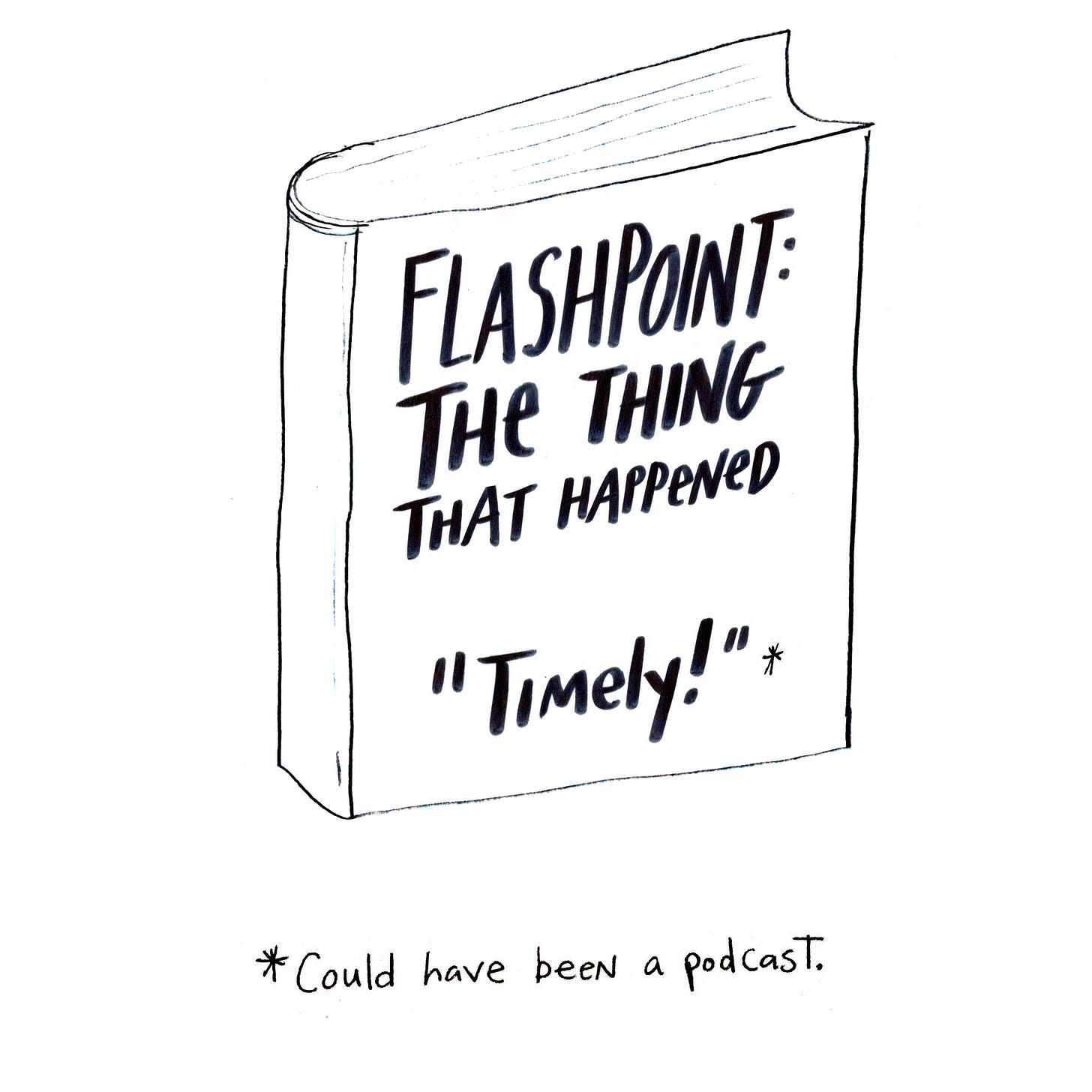
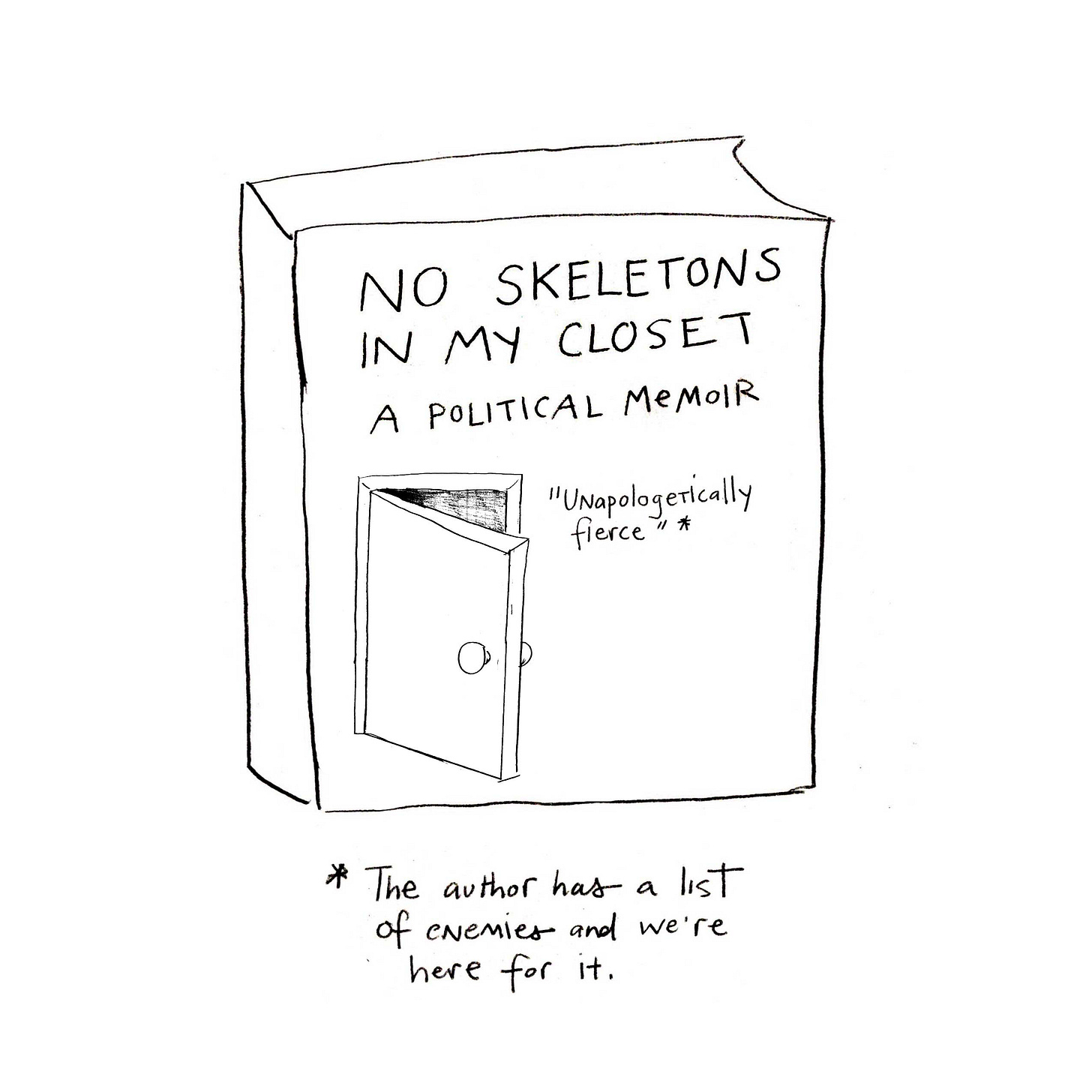
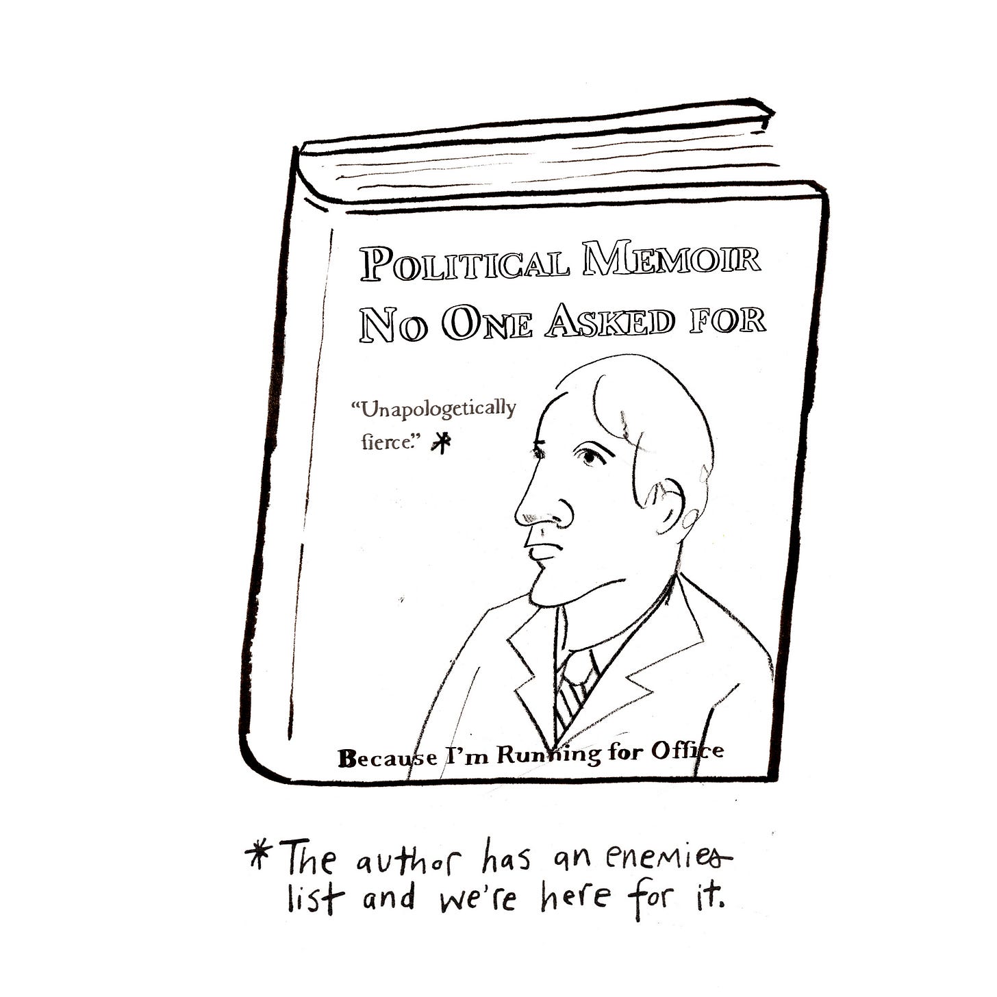
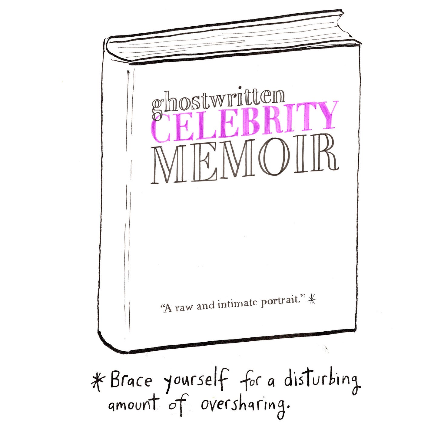
The first piece we came up with wasn’t quite there yet, and was politely turned down. For this attempt we’d tried to think of fake dumb titles based on real books, but this didn’t pan out so well.
Some of our rejected ideas:
One of the issues was that our premise had two jokes in one—the blurb translation joke, plus the title of the book joke—and were taking the reader off in different directions.
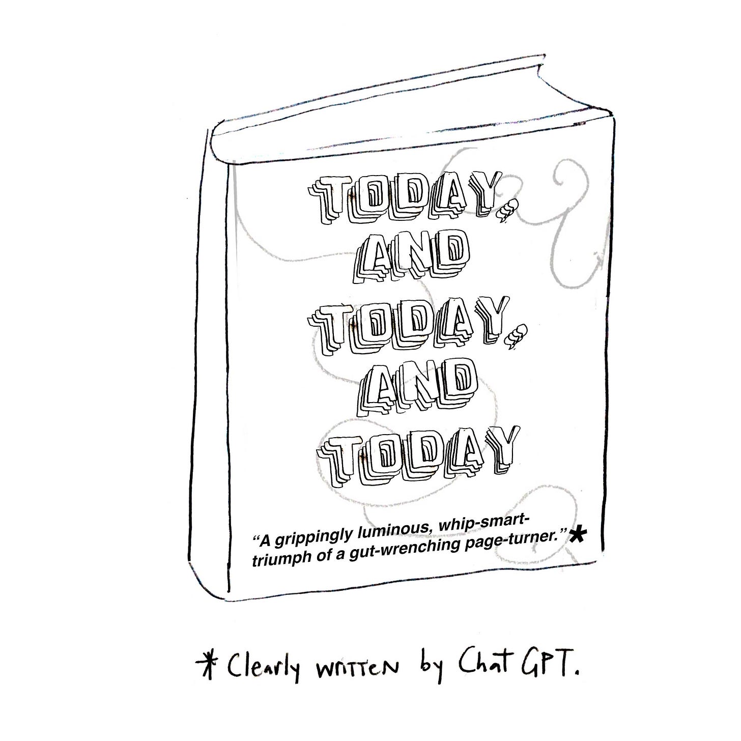
After many Google doc revisions / FaceTime calls / professional humor writer consults and joke trades later (“okay, how about we go with your current affairs if you agree to use my wellness influencer?”) we decided to change course and turn the titles to descriptions of what the books were in title-y fonts, rather than actual fake titles.
We also tried to make sure the typography was more in line with the kind of book it was, which we hadn’t done in the first draft. It made them look more like books you’d actually see (well, sort of), and also help illustrate the book’s tone.

This time we were accepted! Hooray!
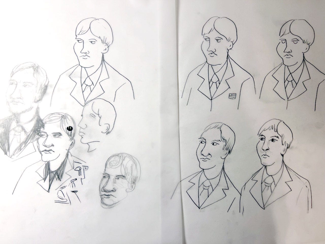
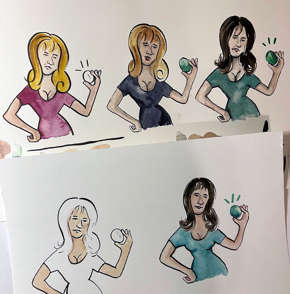
Now it was time for the final artwork. A few of the finals were easier than others—some of the pure typography titles were relatively straightforward, but the ones featuring people I had to sketch out several times to get the right expressions.
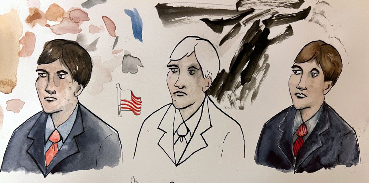
(At one point I actually Googled “smug politician” for photo reference, but this mostly just brought up that picture of Trump with his infamous shit-eating grin humping an American flag, which was not what I wanted to see, thank you.)
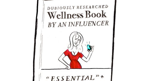
The crystal-toting influencer lady was another one of those people I wanted to get juuuuuuuust right. In the first several, the boobs looked weird! Obviously I could NOT have a weirdly-boobed figure in Gila “Feel it on the First” Pfeffer’s debut New Yorker piece!
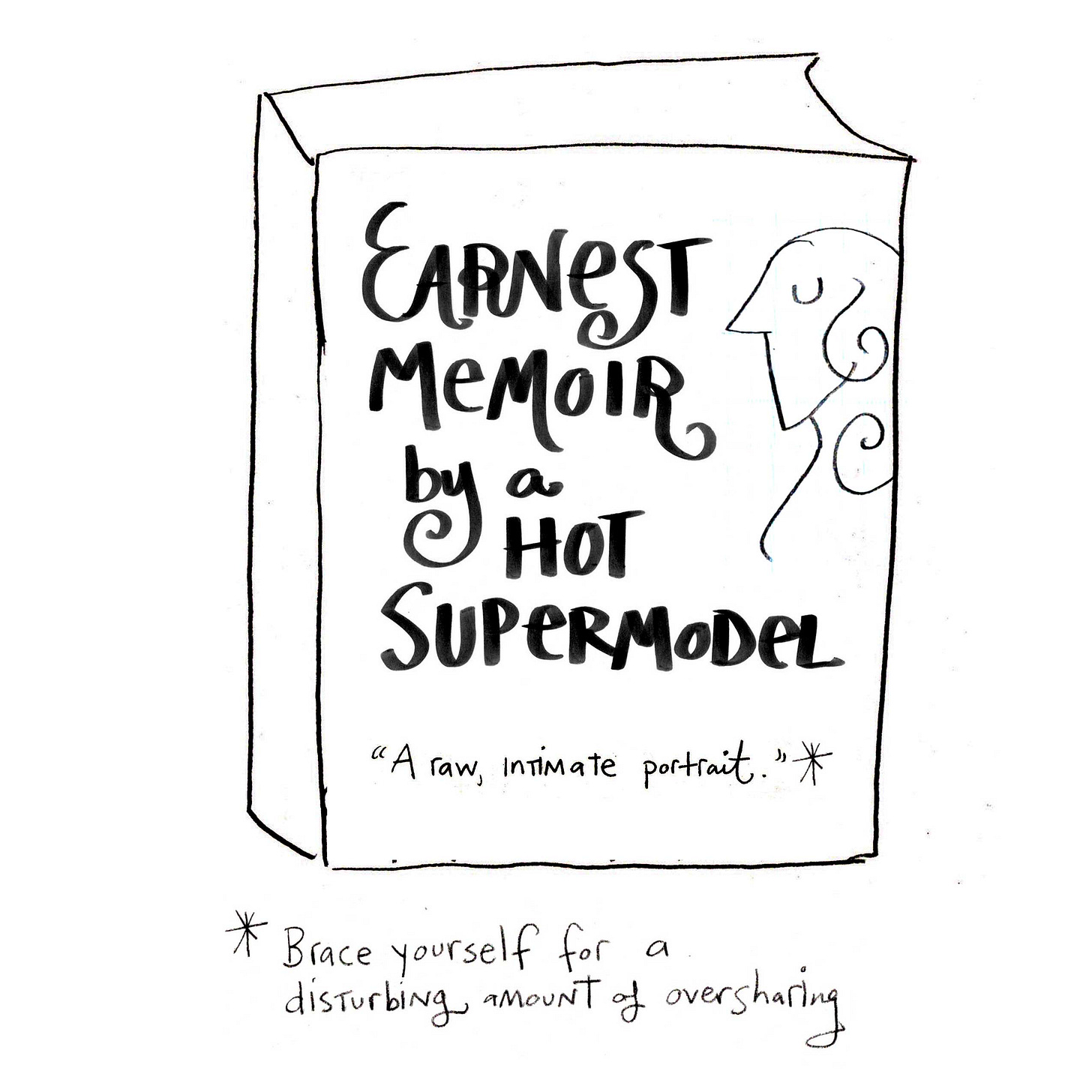
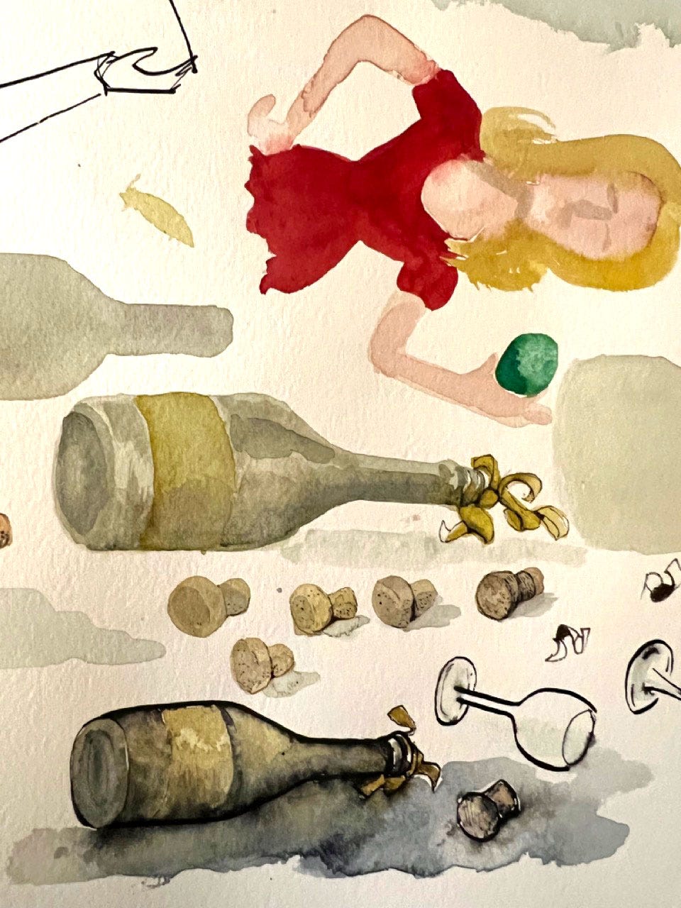
The memoir one also took a few tries. I wound up really liking the colors little drawing of a bottle and champagne glass I did here, and wound up using that as the cover art.
I won’t go into the Photoshop work of combining and cleaning up the cover elements, but I’m happy to answer questions in the comments.
Anyhow, you can read the whole thing here! Think of us when you encounter your next “tour de force.”
Before you go:
Pre-order Gila’s book, Nearly Departed: Adventures in Loss, Cancer, and Other Inconveniences now!
Feeling too comfortable? Or not comfortable enough? I’m teaching a class on August 25th - 30th at the Omega Institute in upstate New York called, “Roaming in and Out of Your Comfort Zone” where we will explore what this often misunderstood place can teach us creatively. Join me!






Love this BTS. Thanks for sharing!
Brilliant! 😆 Did you have to watch hours of Wellness Tok to get this influencer just right? Well done!